By Kelsey Durham
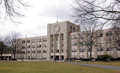
St. John’s University says students and staff have reacted positively to the school’s decision to return to a former university brand that included changes to the school logo and nickname.
The university launched a re-branding campaign after a study conducted in summer 2012 led the school to shift its focus onto how it was presented to the public. Students, staff, alumni, nearby residents and students at other universities were surveyed and results led to several changes within the university, including changing the school’s acronym from STJ back to SJU.
Hallie Sammartino, vice president for marketing and communications, said the decision to return to SJU as a nickname was based on several factors that were discovered as a result of the survey.
“We were only STJ for seven or eight years and it was really driven by the fact that we just couldn’t use SJU as a web address,” she said. “But the alumni never really came to be in love with that. It really wasn’t an acronym for our school because it didn’t reflect our name.”
Sammartino said the school began updating gear during the summer of 2013 and found that students welcomed the new acronym. She said even upperclassmen and recent alumni who never knew the school as SJU really took to the new name.
“We knew there would be seven or eight years worth of people who would have to figure it out and get used to it, but I think overall the students are the most vocal force and they’ve really embraced it,” said Sammartino.
The university also replaced its crest with an updated icon that reintroduced blue into the logo, replacing the black that took over with the change to STJ. Sammartino said the new logo is indicative of many things that St. John’s wanted to stress in its public image.
She said the blue represents the Virgin Mary, which ties into the Catholic and Vincentian mission upon which the university was founded. The logo also got an updated font that the school thought was more of an academic look and better represented the higher institution of learning that it is.
“We wanted to go back to the roots of our heritage and it was pretty much a runaway that people liked it when they saw it,” she said. “Any school with a history this long needs to really be proud of themselves.”
Sammartino said the changes were designed to be gradual in order to reduce the overall cost of updating everything that represents the university to reflect its new brand. Money is being taken from each year’s operating and advertising budgets to progressively complete the project.
With a new website, logo and acronym in place, the school is set to begin to put new signage around the entire campus within the coming weeks, Sammartino said. She said she thinks the St. John’s community is happy with the changes that have been made and hopes that the follow-up studies planned over the next few years will reflect that.
“There’s really been no opposition, honestly,” she said. “They’ve really, truly embraced it.”
Reach reporter Kelsey Durham at 718-260-4573 or by e-mail at kdurham@cnglocal.com.