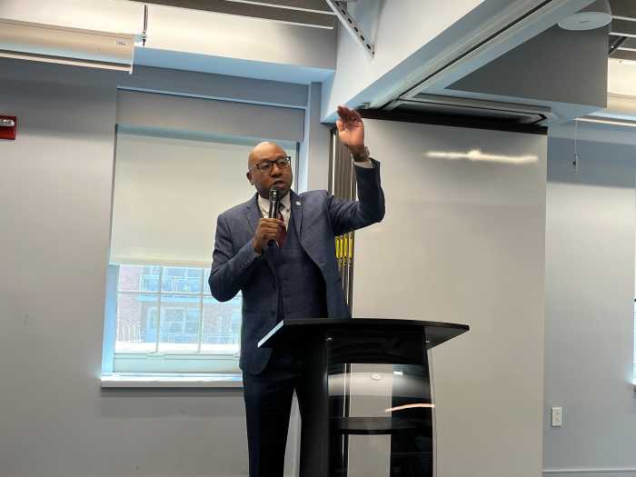
In order to honor and serve the diversity of it customers and communities, Queens Library President and CEO Dennis Walcott announced and new long-term initiative Monday that includes a name change.
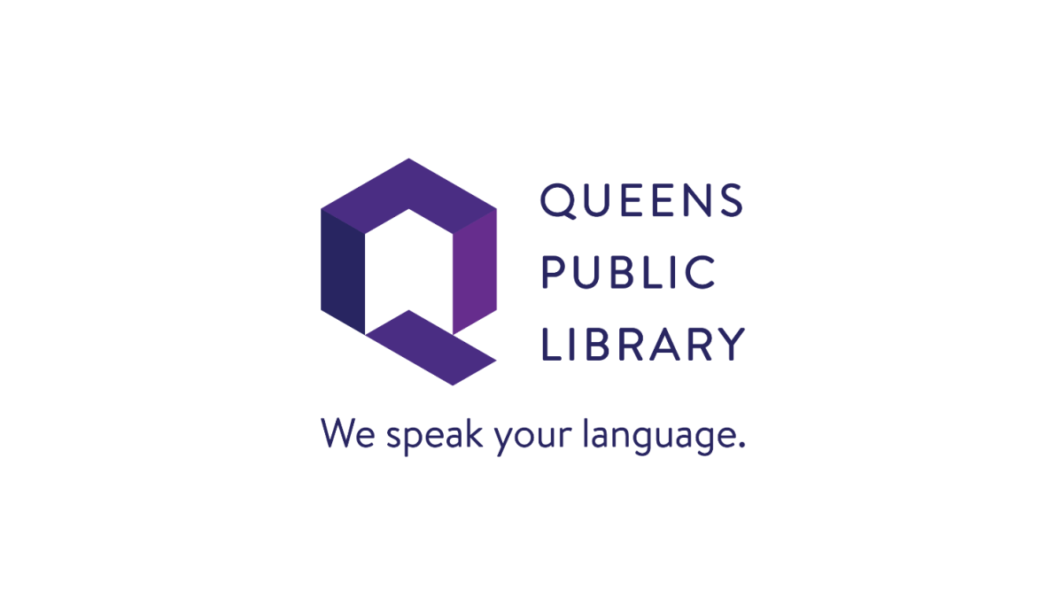
As part of its Renewed Promise to the Public initiative, the library will now be known as Queens Public Library (QPL) with a new logo, tagline, pattern and colors, a new website, and a sharpening of its focus on customer experience.
“We want to make it clear who we are, what we aspire to be and what people can expect from us whenever they walk into one of our locations, have an interaction with us, call us, or visit us online,” Walcott said, promising to visit QPL’s 65 locations across the borough in 65 days to welcome the public alongside library staff.
The previous logo, adopted in 2005 when the library was known as Queens Library, was an orange and yellow book topped by a wing with the tagline “Enrich Your Life.” QPL’s main color is now purple, a color associated with some of the qualities QPL seeks to cultivate, such as wisdom, creativity, dignity and ambition, and a secondary palette of colors highlights the vibrancy and diversity of the public library serves.
The new tagline is “We speak your language.” It means QPL not only speaks Spanish, Chinese, Bengali, Russian, Greek and many other tongues, but also imagination, tech, history, LGBTQ, HTML, finance, non-fiction, science, fiction, story time, chess, teens, opportunity, and many other interests and pursuits. It makes clear that the library is here for everyone, understanding what their needs are and helping them pursue their goals, according to QPL’s announcement.
“We are upholding a promise that requires us to define how we think about our role in fulfilling the public’s needs, how the public perceives us and the experience we are committed to delivering,” Walcott said.
The new logo is a Q comprised of tilted pieces that signify the many diverse perspectives of Queens Public Library, its resources, programs and services, and communities. It uses two- and three-dimensional space to express QPL’s physical and cultural characteristics.
In two dimensions, the mark is the letter Q, referencing the library’s name and the borough of Queens. In three dimensions, it houses an open book, an open doorway, and a welcome mat, extending QPL’s promise of welcoming everyone. All QPL locations now have tablets dedicated to Google Translate so staff can have conversations in multiple languages with customers. The library will also offer another type of translation device at every site and will soon pilot a language line service offering telephone interpretation at several locations.
“The word renewal recognizes our 123-year history and that we are constantly evolving to meet the changing needs of our communities,” Walcott said. “And we added ‘public’ back to our name to reinforce who is at the center of our work and to whom the library belongs.”
The new website is faster, easier to navigate and search, and clearer, with more contrast to better meet ADA compliance and it can be translated into over 80 languages. It also features a responsive design which will work on PCs and mobile devices with different screen sizes.
“Our ‘Renewed Promise to the Public’ is not just about words,” Walcott said. “It is about helping people get where they want to go in their lives by working hard to understand where they are coming from.”